University Marketing and Communications
Typography
Typography in graphic design impacts meaning and can strongly affect how people react to a document. The skillful use of typography commands the attention of your desired audience, communicates a key idea and motivates them to take action. Typography is not just about legibility. It is a blending of art and science and can serve a functional purpose. Careful selection and consistent use of a chosen typeface can be just as important as the use of graphics, color and images in creating and solidifying a professional brand.
Primary Typefaces
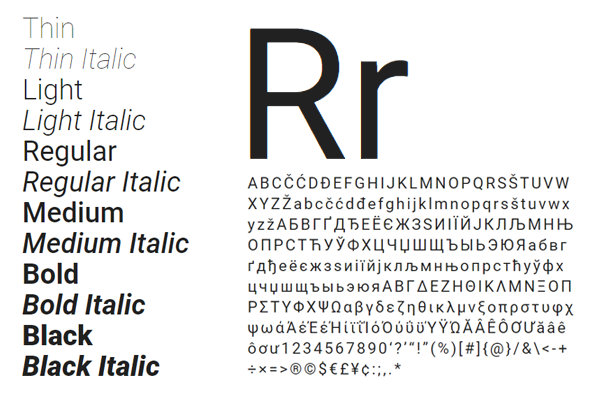
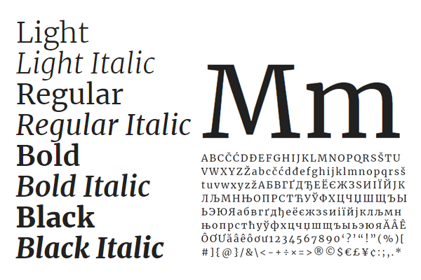
We’ve chosen two modern, open-source serif and sans-serif typeface families that have been adapted for the digital age (but are also suitable for print) — Roboto by Google, Inc. and Merriweather by Eben Sorkin of Sorkin Type, Co. Both typefaces were designed to be highly-readable on screens and contain a full set of weights, styles and variants.
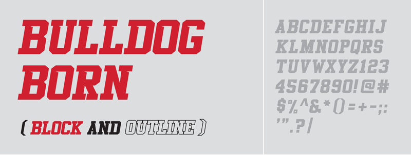
The “Bulldog Born” font is a custom font, designed by Fresno State designer Joel Beery, and is exclusively used for Fresno State Athletics.
“Typography is the craft of endowing human language with a durable visual form.”
- ROBERT BRINGHURST, TYPOGRAPHER/AUTHOR
Font Substitutes
Font substitution is the process of using one font in place of another when the intended font either isn’t available or doesn’t contain glyphs for the required characters. The following alternative fonts may be used when the primary university typefaces are not available for use in certain digital applications, devices or platforms.
Alternatives to Roboto
Arial, Arial Black, Helvetica, Segoe UI, San Francisco
Regular, Italic and Bold
Alternatives to Merriweather
Georgia
Regular, Italic, Bold and Bold Italic


